TableList
require(["esri/widgets/TableList"], function(TableList) { /* code goes here */ });esri/widgets/TableListThe TableList widget provides a way to display a list of tables associated with a Map. It is meant to be used with feature layer tables.
If a map contains feature layer tables, they will display within the widget. Tables can also be added to the map's tables collection. Any tables referenced in the map property will display in the widget. If unsure of whether the layer is a table, check the feature layer's isTable property.
The ListItem API provides access to each table, allows the developer to configure actions related to the table, and allows the developer to add content to the item related to the table.
Known Limitations The TableList widget is not supported with web scenes.
- See also:
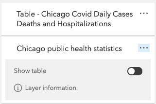
const tableList = new TableList({
  map: map, // takes any tables associated with the map and displays in widget
  selectionEnabled: true,
  listItemCreatedFunction: function(event) {
    let item = event.item;
    item.actionsSections = [
      {
        title: "Show table",
        className: "esri-icon-table",
        id: "table",
        type: "toggle"
      },
      {
       title: "Layer information",
       className: "esri-icon-description",
       id: "information"
      }
    ]
});
Constructors
- new TableList(properties)
- Parameter:properties Objectoptional
See the properties for a list of all the properties that may be passed into the constructor.
Example:// Typical usage const tableList = new TableList({ map: map });
Property Overview
| Name | Type | Summary | Class | |
|---|---|---|---|---|
| String|HTMLElement | The ID or node representing the DOM element containing the widget. more details | more details | Widget | |
| String | The name of the class. more details | more details | Accessor | |
| String | The widget's default CSS icon class. more details | more details | iconClass | |
| String | The unique ID assigned to the widget when the widget is created. more details | more details | Widget | |
| String | The widget's default label. more details | more details | TableList | |
| ListItemCreatedHandler | Specifies a function that accesses each ListItem. more details | more details | TableList | |
| Map|WebMap | A reference to a map containing the tables. more details | more details | TableList | |
| Boolean | Indicates whether more than one list item can be selected by a user at a single time. more details | more details | TableList | |
| Collection<ListItem> | A collection of selected ListItems representing table list items selected by the user. more details | more details | TableList | |
| Boolean | Indicates whether list items may be selected by the user. more details | more details | TableList | |
| Collection<ListItem> | The collection of table ListItems displayed within the widget. more details | more details | TableList | |
| TableListViewModel | The view model for this widget. more details | more details | TableList |
Property Details
The ID or node representing the DOM element containing the widget. This property can only be set once. The following examples are all valid use cases when working with widgets.
Examples:// Create the HTML div element programmatically at runtime and set to the widget's container const basemapGallery = new BasemapGallery({ view: view, container: document.createElement("div") }); // Add the widget to the top-right corner of the view view.ui.add(basemapGallery, { position: "top-right" });// Specify an already-defined HTML div element in the widget's container const basemapGallery = new BasemapGallery({ view: view, container: basemapGalleryDiv }); // Add the widget to the top-right corner of the view view.ui.add(basemapGallery, { position: "top-right" }); // HTML markup <body> <div id="viewDiv"></div> <div id="basemapGalleryDiv"></div> </body>// Specify the widget while adding to the view's UI const basemapGallery = new BasemapGallery({ view: view }); // Add the widget to the top-right corner of the view view.ui.add(basemapGallery, { position: "top-right" });
The name of the class. The declared class name is formatted as
esri.folder.className.
- iconClass Stringinner
The widget's default CSS icon class.
The unique ID assigned to the widget when the widget is created. If not set by the developer, it will default to the container ID, or if that is not present then it will be automatically generated.
- label String
The widget's default label.
- listItemCreatedFunction ListItemCreatedHandler
Specifies a function that accesses each ListItem. Each list item can be modified according to its modifiable properties. Actions can be added to list items using the actionsSections property of the ListItem.
Example:const tableList = new TableList({ map: map, selectionEnabled: true, listItemCreatedFunction: function(event) { let item = event.item; item.actionsSections = [ [ { title: "Go to full extent", className: "esri-icon-zoom-out-fixed", id: "full-extent" } ] ]; } });
A reference to a map containing the tables. Set this property to access the underlying tables within the map.
- See also:
Example:Layer.fromPortalItem({ // Loads a layer (table) from a portal item portalItem: { // autocasts new PortalItem() id: "add portal item id" } }).then(function(layer) { // Load the layer layer.load().then(function() { // Check if the layer is a table if (layer.isTable) { map.tables.add(layer); console.log(map.tables); } }); }); const tableList = new TableList({ map: map // map contains tables collection });
- multipleSelectionEnabled Boolean
Indicates whether more than one list item can be selected by a user at a single time. SelectionEnabled must be set to
truefor this property to have an effect on the widget.Selected items are available in the selectedItems property.
- Default Value:false
- See also:
Example:tableList.selectionEnabled = true; tableList.multipleSelectionEnabled = true;
- selectedItems Collection<ListItem>
A collection of selected ListItems representing table list items selected by the user.
- See also:
- selectionEnabled Boolean
Indicates whether list items may be selected by the user. Selected items can by reordered in the list by drag and drop using the mouse or touch screen as well as with arrows on the keyboard.
Selected items are available in the selectedItems property.
- Default Value:false
- See also:
Example:tableList.selectionEnabled = true;
- tableItems Collection<ListItem>readonly
The collection of table ListItems displayed within the widget.
- viewModel TableListViewModelautocast
The view model for this widget. This is a class that contains all the logic (properties and methods) that controls this widget's behavior. See the TableListViewModel class to access all properties and methods on the widget.
Method Overview
| Name | Return Type | Summary | Class | |
|---|---|---|---|---|
| String | A utility method used for building the value for a widget's | more details | Widget | |
Destroys the widget instance. more details | more details | Widget | ||
| Boolean | Emits an event on the instance. more details | more details | Widget | |
| Boolean | Indicates whether there is an event listener on the instance that matches the provided event name. more details | more details | Widget | |
| Object | Registers an event handler on the instance. more details | more details | Widget | |
Widget teardown helper. more details | more details | Widget | ||
This method is primarily used by developers when implementing custom widgets. more details | more details | Widget | ||
| Object | This method is primarily used by developers when implementing custom widgets. more details | more details | Widget | |
Renders widget to the DOM immediately. more details | more details | Widget | ||
This method is primarily used by developers when implementing custom widgets. more details | more details | Widget | ||
Triggers the trigger-action event and executes the given action or action toggle. more details | more details | TableList |
Method Details
A utility method used for building the value for a widget's
classproperty. This aids in simplifying CSS class setup.Parameter:repeatable The class names.
Returns:Type Description String The computed class name. Example:// .tsx syntax showing how to set CSS classes while rendering the widget render() { const dynamicIconClasses = { [CSS.myIcon]: this.showIcon, [CSS.greyIcon]: !this.showIcon }; return ( <div class={classes(CSS.root, CSS.mixin, dynamicIconClasses)} /> ); }
- destroy()inherited
Destroys the widget instance.
Emits an event on the instance. This method should only be used when creating subclasses of this class.
Parameters:type StringThe name of the event.
event ObjectoptionalThe event payload.
Returns:Type Description Boolean trueif a listener was notified
Indicates whether there is an event listener on the instance that matches the provided event name.
Parameter:type StringThe name of the event.
Returns:Type Description Boolean Returns true if the class supports the input event.
Registers an event handler on the instance. Call this method to hook an event with a listener.
Parameters:A event type, or an array of event types, to listen for.
listener FunctionThe function to call when the event is fired.
Returns:Type Description Object Returns an event handler with a remove()method that can be called to stop listening for the event(s).Property Type Description remove Function When called, removes the listener from the event. Example:view.on("click", function(event){ // event is the event handle returned after the event fires. console.log(event.mapPoint); });
- own(handles)inherited
Widget teardown helper. Any handles added to it will be automatically removed when the widget is destroyed.
Parameter:handles WatchHandle|WatchHandle[]Handles marked for removal once the widget is destroyed.
- postInitialize()inherited
This method is primarily used by developers when implementing custom widgets. Executes after widget is ready for rendering.
This method is primarily used by developers when implementing custom widgets. It must be implemented by subclasses for rendering.
Returns:Type Description Object The rendered virtual node.
- renderNow()inherited
Renders widget to the DOM immediately.
- scheduleRender()inherited
This method is primarily used by developers when implementing custom widgets. Schedules widget rendering. This method is useful for changes affecting the UI.
- triggerAction(action, item)
Triggers the trigger-action event and executes the given action or action toggle.
Parameters:action ActionButton|ActionToggleThe action to execute.
item ListItemAn item associated with the action.
Type Definitions
- ListItemCreatedHandler(event)
Function definition for the listItemCreatedFunction property.
Parameters:event ObjectAn object containing a list item created by the TableList.
Specification:item ListItemA list item created by the TableList. You can modify the properties of this item to customize the text, actions, and visibility of the list item. See the documentation for the listItemCreatedFunction for more details.
Event Overview
| Name | Type | Summary | Class | |
|---|---|---|---|---|
{action: ActionButton,ActionToggle,item: ListItem} | Fires after the user clicks on an action or action toggle inside the TableList widget. more details | more details | TableList |
Event Details
- trigger-action
Fires after the user clicks on an action or action toggle inside the TableList widget. This event may be used to define a custom function to execute when particular actions are clicked.
- Properties:
- action ActionButton|ActionToggle
The action clicked by the user.
item ListItemAn item associated with the action.
Example:tableList.on("trigger-action", function (event) { let item = event.item; // Capture the action id. let id = event.action.id; if (id === "information") { window.open(item.layer.url); } });